Most delays with the first order of shakers come from the file, not the machine. A low-resolution JPG logo,
RGB colors, text without outlines — each of these errors means a round of corrections and several days lost before work even begins
on the visualization.
This guide shows how to prepare a design so it passes verification the first time: technical requirements,
specifics of graphics on a cylinder, and a checklist before sending.
Technical requirements: format, colors, outlines
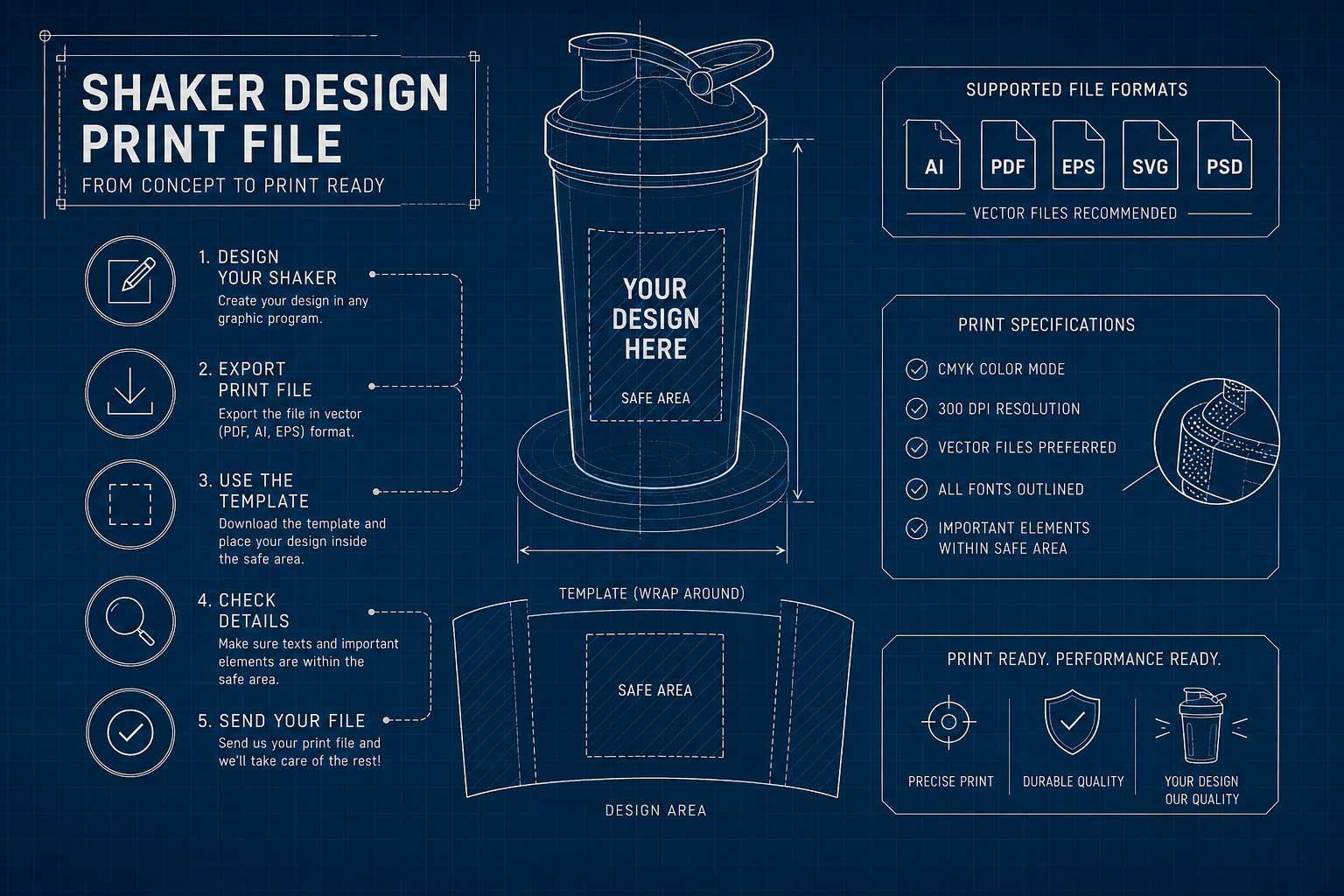
Vector format is essential. AI, EPS, or PDF. Vectors scale without losing quality, which is crucial when printing on a curved surface. We can work with such a file immediately, without additional questions.
If you only have raster graphics, prepare them at a resolution of at least 300 dpi at the target print size; for fine details, it is better to aim for 600 dpi. A file exported from Canva or a screenshot from a presentation usually won’t pass – pixelation during scaling is inevitable.
Colors in CMYK or Pantone. Files prepared in RGB look great on screen, but after conversion, the shades shift — especially noticeable in blue, orange, and deep green. If your branding relies on specific corporate colors, provide Pantone values and ensure they are correctly named in the file.
Text converted to outlines. Without this, we will see a different font or an error — because we don’t have your font installed.
Cleaned file. No working layers, clipping masks, or unused elements.
Gradients and semi-transparencies are not an option. For printing based on separated colors (screen printing), you cannot print a gradient. If you would like to achieve a similar effect, you must use a raster; this way you can get close to this effect, but the reproduction will not be 100%. If you do it skillfully, the effects can be really interesting. This leads to the most important design rule for shakers.
Design with colors, not shades
We print on shakers in separated colors — standardly 1–4 (or more upon client request). This is not photographic printing: tonal transitions and photos are not an option.
It sounds like a limitation, but in practice, it works in your favor because the price depends solely on the number of colors, not the size of the graphic. A full wrap costs the same as a small logo on the side.
Design conclusion: simplify the palette and use the entire surface. A bold, two-color mark stretched across the entire shaker looks better — and costs the same — as the same mark fitted into a narrow strip on the front.
Practically, this means:
- simple forms and solid color patches instead of complex compositions
- avoiding very thin lines and small text that may blur on the curve
- high contrast relative to the body color
If your brand’s logo is based on a gradient, prepare a simplified version for separated colors before sending an inquiry. Retouching at the quote stage consumes time that is better spent refining the layout.
Print area and safe zone
Print area is the area that can be printed. Safe zone is the margin within this area where you keep key elements so that none of them are cut off or distorted.
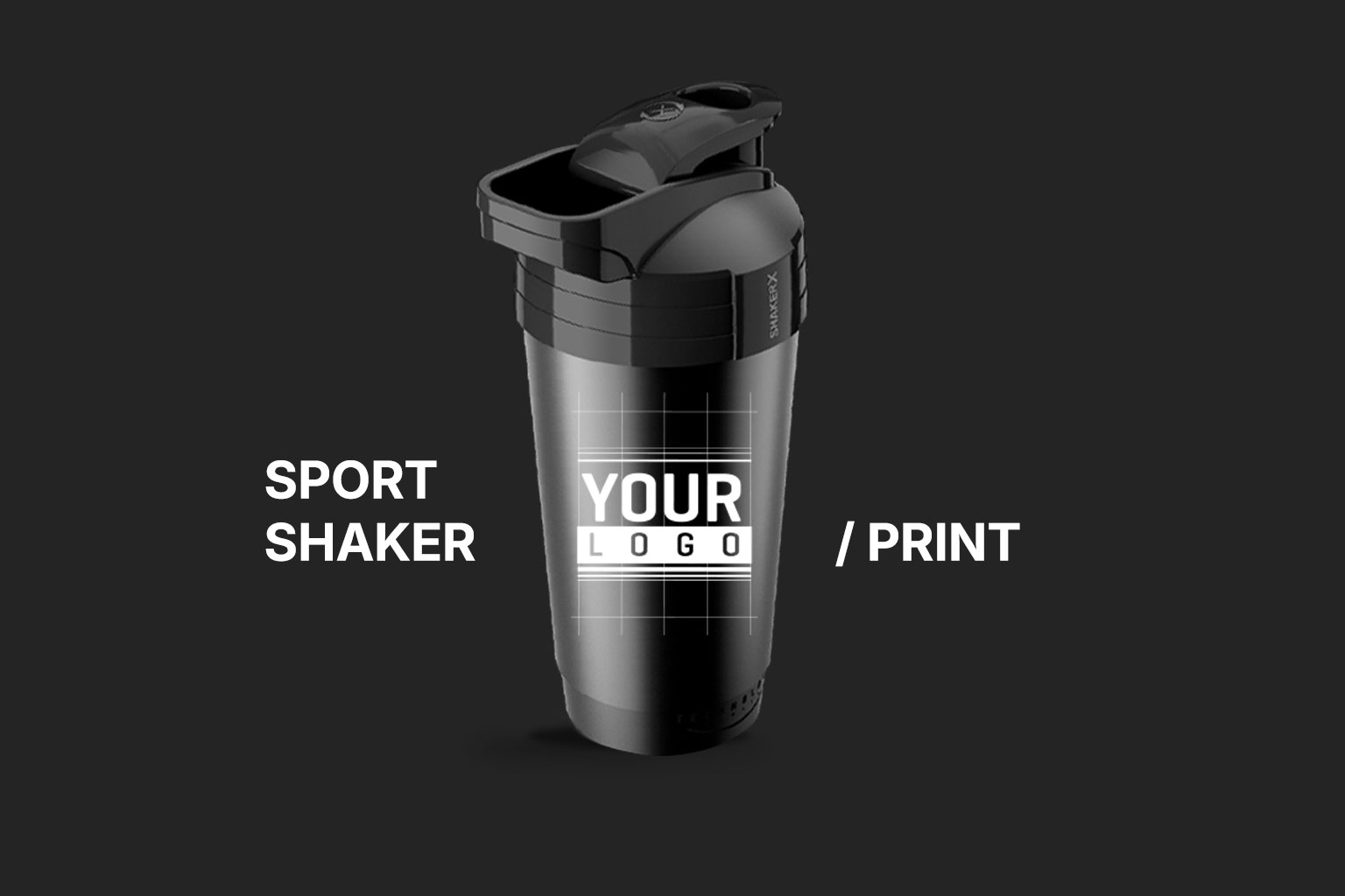
The design for the shaker must be laid out on the cylinder development — the flattened surface of the body. This is a different way of thinking than designing a flat label and is the source of most corrections during the first order.
requires rework — and this delays the visualization and the entire order.
Three things to consider:
Seam line. The logo, brand name, and slogan must not fall on it — the risk of inaccurate alignment is highest there. Also, keep them away from the zone where the user grips the shaker with their hand.
Margins from the thread and bottom. Graphics that “almost” fit in the field often fall outside the area or deform where the cross-section changes when applied to the cylinder.
Pattern continuity. If the design includes a pattern or a horizontal line, it must match exactly at the seam. Test the pattern in a loop before approving the visualization.
The most important advice in the entire article: ask for the print area template before commissioning the design to a graphic artist, not after. The template contains exact dimensions and safe zones. A design made without it often requires rework – and this delays the visualization and the entire order.
Container and cap color as part of the design
The choice of series has a direct impact on how the logo colors will look.
On a white background, the print comes out exactly as in the design.
This is a safe choice for brands with a multi-colored, graphic logo.
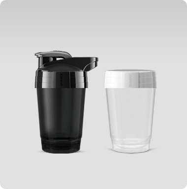
On a black container, colors can be less saturated, and light graphic elements may become invisible without an underprint. A minimalist logo in one clear color scales well here and gives a better effect.
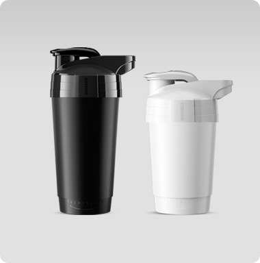
The cap is an element that catches the eye before anyone reads the brand name. There are 12 standard colors to choose from. Start with the brand book, check which shade defines your brand, and choose a color that matches your logo or is complementary to the container — so that the logo remains legible.
Have Pantone or RAL codes ready at the brief stage. This shortens conversations and eliminates misunderstandings during approval.
Practical tip: prepare three versions of the logo – color, black, and white. You will have files ready for every combination of container and cap, instead of going back to the graphic artist during approval.
Visualization: what to check before approval
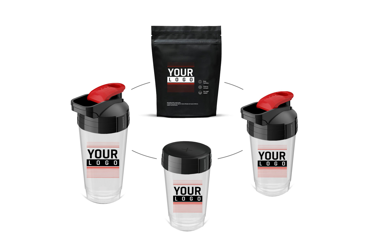
Visualization is a rendered preview of the finished product with your logo, prepared before production starts.
For us, it is free and ready within 24 hours of sending the file.
Without it, you risk the logo being too small, colors too weak, and small text illegible after being applied to the material.
These are errors that cannot be undone after production without the cost of repeating the batch.
What to pay attention to:
Evaluate in zoom-out, not just zoom-in. Check if the logo and text are legible from a meter’s distance — just as your customer will see the product. This is a real test of branding usability, not aesthetics.
Contrast between the color of the container, cap, and print.
Logo proportions relative to the entire surface.
Graphic continuity at the seam when printing on the full circumference.
Content correctness: brand name, website address, contact details. It sounds trivial, but it is the most overlooked point.
Approve the design in writing or via email. This is the formal starting point for production and the basis for any potential complaint if the final product deviates from the approved design. If something looks “almost good,” it is not good enough – every doubt raised now is cost-free.
Three mistakes that cost the most time
Error 1: low-resolution JPG logo. The most common problem that immediately stops the process. The file goes back for correction, and you wait for more days before work on the visualization begins. A vector eliminates this immediately.
Error 2: lack of written approval. It only comes to light after production. Disputes about color, size, or logo placement are then difficult to resolve because there is no document confirming the arrangements.
Error 3: design without a template. The graphic artist proposes a layout that, when applied to the cylinder, falls outside the zone or distorts the logo where the cross-section changes. One round of corrections ahead — avoidable with one email asking for a template.
Checklist before sending
Unlike online ads or flyers:
- Vector file: AI, EPS, or PDF
- Text converted to outlines
- Colors in CMYK or indicated in Pantone
- Raster elements at least 300 dpi at 1:1 scale
- Gradients and shadows removed or minimized
- Three versions of the logo: color, black, white
- Selected capacity (400 ml or 700 ml) and cap color
- Known print area based on the template
- Key elements away from the seam line
- File cleaned of working layers
The better you prepare before sending, the faster the product will reach your customers’ hands. Every missing point is a potential day of delay.
Summary
Designing a shaker with a logo comes down to a few decisions: file format, simplified palette, contrast relative to the body, and a layout adapted to the cylinder development.
The rule that organizes the rest: you pay for colors, not for the surface. Instead of shrinking the graphic to fit the budget, simplify the palette and use the entire shaker.
Send your logo and choose the capacity; you will see the visualization on the same day, within a maximum of 24 hours.