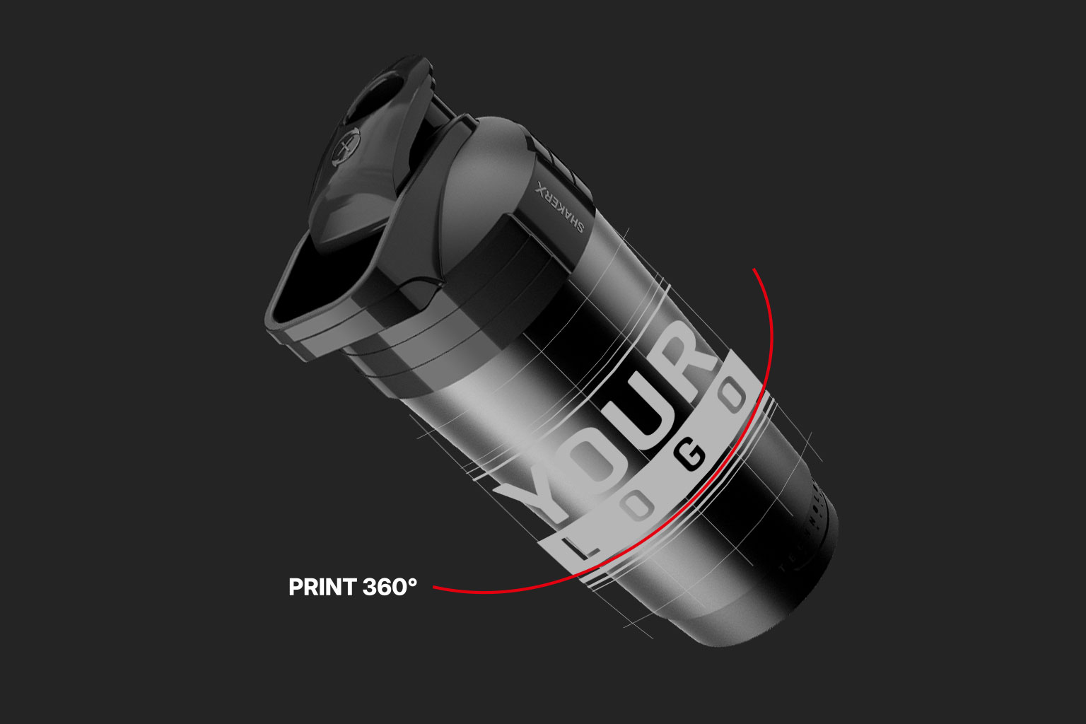
A custom shaker with your logo is one of the most effective branding tools for a supplement brand: visible at the gym, in a sports bag and on a retail display. Customers reach for it several times a day, and every use brings them into contact with your brand. Few products offer such a consistent presence in a customer’s daily routine.
This article walks you through the entire process: from choosing the capacity and preparing your artwork to approving the mockup and placing your order. Before sending your first brief, there are several decisions worth considering carefully — you will find them all below.
Co znajdziesz w artykule?
- Capacity should be guided by your formula, not aesthetics
- Materials and documentation: a matter of compliance, not aesthetics
- Lid colour and body range as part of your brand identity
- Printing: the number of colours matters, not the size of the artwork
- Artwork file requirements
- A mockup before production
- MOQ, lead times and a checklist for your brief
- Summary
Capacity should be guided by your formula, not aesthetics
This is the first decision — and the one most often made incorrectly.
400 ml works well for smaller servings: a scoop of protein powder, creatine or BCAAs mixed with 250–350 ml of water. It is compact, fits into most gym bags and looks great on a retail display.
700 ml provides extra room for mass gainers with large serving sizes, products mixed with milk and situations where users prefer to dilute their supplement with more liquid. It also offers a noticeably larger area for your artwork.
The key question: how much liquid does your formula need to dissolve properly and taste good? If the minimum is 500 ml, a smaller shaker will frustrate customers every time they use it — and that frustration will carry over to the brand whose logo appears on the product.
Consider offering both sizes: 400 ml as the “at work” option and 700 ml as the “at the gym” version. Both capacities support the full range of customisation options.
Then there is the 2in1 design: one container with two interchangeable lids works both as a shaker and as a leakproof food container. For a supplement brand, this is a natural extension of the product offering — customers get a product that stays with them throughout the day, rather than just for 20 minutes after a workout.
Materials and documentation: a matter of compliance, not aesthetics
For a supplement manufacturer, material selection is not just about appearance — it is also a regulatory matter.
Food-contact certification and PPWR confirm that the plastic has undergone laboratory testing and has been approved for contact with food. Our shakers are made from certified plastic, and we provide the documentation when you place an order.
The “BPA-free” label describes a material safety characteristic; it is not a separate type of plastic or a document. Many suppliers use this label for marketing purposes without documentation confirming compliance. Always ask for a specific certificate covering the model or material, rather than a general assurance.
Legal requirements may vary depending on the product’s classification and how it is sold. If you plan to bring a shaker to market as part of your commercial offering, it is worth checking the current requirements or consulting a regulatory adviser.
Lid colour and body range as part of your brand identity
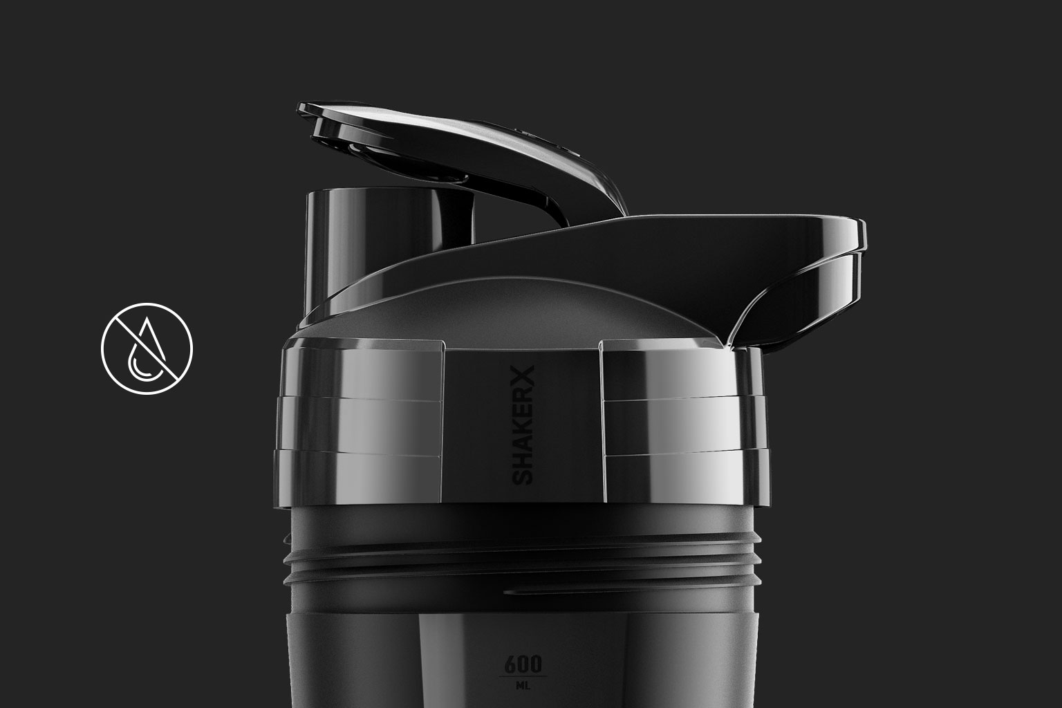
The lid is one of the shaker’s most visible elements. From a design perspective, it catches the eye before anyone reads the brand name. A well-chosen lid makes the shaker look like a thoughtfully designed product rather than a generic giveaway.
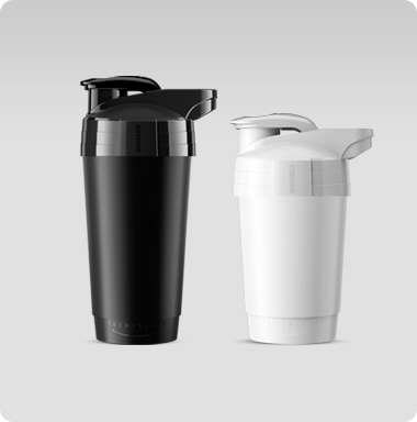
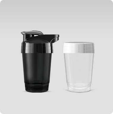
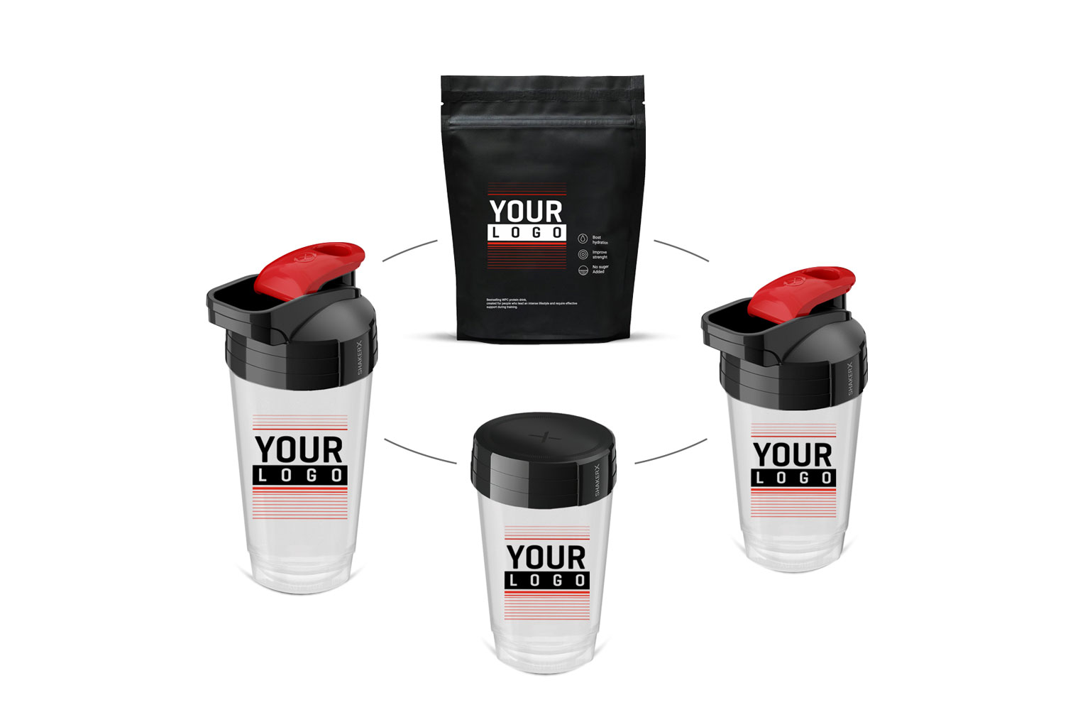
You can choose from 12 standard lid colours and two body ranges: Black and White and transparent.
Your choice of range directly affects how your logo colours are reproduced:
On a white background, the print appears exactly as it does in the artwork. This is a safe choice for brands with colourful, graphic logos.
On a black container, colours can appear less saturated, and light elements of the artwork may become invisible without an underbase. A minimalist logo in a single light colour works well here and creates a more premium look.
Have your RAL or Pantone codes ready when preparing the brief. This speeds up discussions and prevents misunderstandings when approving the mockup. If you are unsure, ask to see mockups of both versions side by side.
Printing: the number of colours matters, not the size of the artwork
Here is a difference that directly affects your budget.
Most suppliers base their printing prices on the print area — the larger the artwork, the more you pay. Our pricing depends solely on the number of colours. Printing around the shaker’s entire circumference costs exactly the same as a small logo on the side. Each additional colour increases the price by a fixed amount, regardless of the order quantity. Our standard printing options cover 1–3 colours, with additional colours available on request.
For a supplement brand looking to stand out on a crowded shelf, this offers a clear benefit: 360° printing turns the entire body into a branding surface without an additional charge for the print area.
The design takeaway: simplify your colour palette and make use of the whole shaker. A bold two-colour design wrapped around the body costs the same as the same design placed within a narrow strip — but it can be seen from every angle.
If your brand identity relies on gradients or complex tonal transitions, prepare a simplified version with clearly separated colours before sending your enquiry.
Artwork file requirements
The manufacturer requires a PDF, AI or EPS file in CMYK, with all text converted to outlines and raster elements at a minimum resolution of 300 dpi at actual size (1:1). Allow for 2–3 mm of bleed.
Font substitution is the most common issue — without outlined text, we may see a different typeface or an error without you realising it.
Specify Pantone colours only if the manufacturer actually supports them. Otherwise, automatic conversion to CMYK may alter the shade of your logo, especially when using highly saturated brand colours. Ask directly: “Do you print Pantone as spot colours, or do you convert them to CMYK?”
Laying out artwork for a cylindrical surface. The artwork must be prepared on a flat layout of the cylinder. Key elements — your logo, name and slogan — must not fall on the print seam or in the area where users grip the shaker. Leave a margin along the top and bottom edges as well.
The simplest way to avoid these issues: request a template showing the print area dimensions before briefing your graphic designer. This allows the designer to work with the correct dimensions from the start, rather than discovering a problem after the mockup has been approved.
Project mockup before production
Our mockup is free and ready within 24 hours of receiving your artwork. For supplement companies planning a product launch on a specific date, this is a clear advantage over suppliers who take several days to respond or require payment before providing a preview.
Approving the mockup finalises the design — any changes after this stage result in additional costs and delays. Check each of the following carefully:
Consistency between the lid colour and your brand palette
Logo legibility on both sides of the shaker
Artwork proportions in relation to the print area
No design elements too close to the edges or crossing the print seam
Correct orientation of all text and symbols
A match between the lid colour and the Pantone or RAL code specified in the brief
If something in the mockup looks “almost right”, it is not good enough. Raising any concerns at this stage costs nothing.
MOQ, lead times and a checklist for your brief
The minimum order quantity is one carton: 60 units for the 400 ml size or 56 units for the 700 ml size. Further orders are supplied in full-carton multiples.
This lets you test the product before a larger rollout, without tying up your budget in stock.
Production lead time: from 7 working days after mockup approval, plus delivery. If you are planning a product launch on a specific date, allow a buffer of at least two weeks in your schedule.
Before contacting us for the first time, prepare the following:
Capacity and body range (400 ml / 700 ml, Black and White / transparent)
Lid colour with its RAL or Pantone code
Number of print colours
Artwork file format and a request for a template
Required order quantity and delivery date
A request for material documentation
It is not a long list. Preparing your answers takes no more than an hour and can save several days of back-and-forth correspondence.
Summary
Designing shakers for a supplement brand comes down to a few specific decisions: a capacity suited to your formula, a material backed by documentation, a lid colour that matches your brand identity, a simplified print palette and an artwork file that meets the requirements.
The biggest causes of wasted time are file errors and specifications that have not been agreed before production — both can be prevented with a single clear brief.
Send us your logo and choose your capacity — you will see your mockup tomorrow.