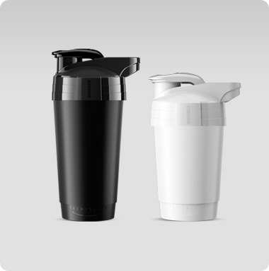
Standard shaker branding covers one area, usually a narrow strip on the front. A 360° print covers the entire circumference of the body. The difference sounds like a technical detail, but it is fundamental to how often your logo is actually seen.
This article explains exactly what full coverage means, how it affects the price, and how to design graphics to use the entire surface without errors at the seam.
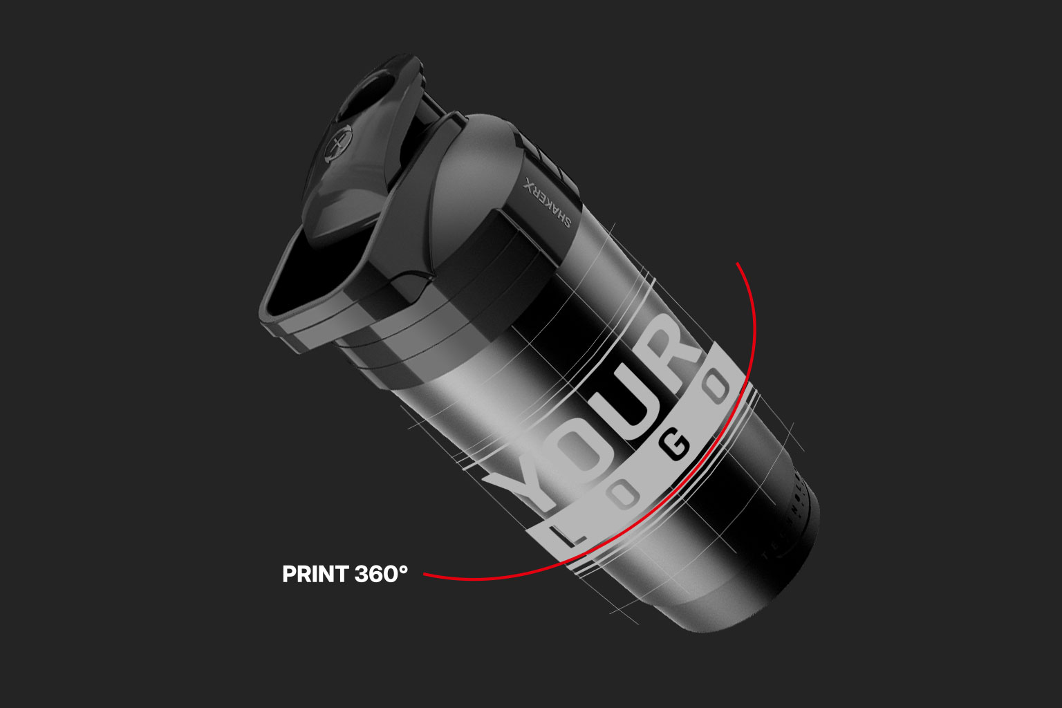
What does “360° print” mean?
A 360° print is a continuous graphic covering the entire circumference of the shaker – without unprinted fragments and without visible gaps. Instead of a small logo in one place, the entire side surface becomes a design space.
The effect is similar to product packaging. A shaker lying on a bench in the locker room “advertises itself” regardless of how it was set down. The same product held in the hand during a workout shows the brand from every angle, not just when it happens to be turned the right way.
With single-sided printing, a significant portion of visual contact is simply lost. A shaker seen from the wrong angle displays an empty surface — and that is all that remains of your gadget budget.
Important when comparing offers: not every supplier declaring “360° print” actually offers full coverage. (in our case, this is printing from the edge of the capacity scale to the other edge of the scale).
Ask about two things separately: what is the coverage range (the entire circumference or a wide strip?) and what are the maximum dimensions of the branding area in millimeters. A supplier who cannot provide dimensions probably does not have a template for the client.
What the price depends on - and why it is the most important question
For most manufacturers, the price of the print depends on the print area. The larger the graphic, the more you pay. In this model, the full circumference is a premium option that you have to pay extra for — which is why many companies give it up at the valuation stage.
With us, the price depends solely on the number of colors.
The size of the print has no influence on the valuation. A full print around the entire shaker costs exactly the same as a small logo on the side. Each subsequent color increases the unit price by a fixed amount, regardless of the quantity and capacity. We standardly work in the range of 1–3 colors; of course, we also print a larger number of colors upon request.
The design conclusion is simple: simplify the palette, use the surface.
A two-color logo stretched over the entire circumference costs the same as a two-color logo in a small area on the side. Since you pay for colors and not for centimeters, there is no reason to leave 80% of the surface empty. This is the only situation where maximum brand exposure does not involve an additional fee.
It also works in reverse: if the budget is tight, reducing from three colors to one lowers the unit price — and the graphic can still cover the entire shaker.
When does 360° make the most sense?
Full coverage pays off particularly clearly in two scenarios.
Fitness clubs and event organizers. A shaker with a club logo is present at every workout: it lies on a bench in the locker room, travels in a backpack, appears in photos after a session. It must look good and be recognizable for months, not weeks. A print on a narrow strip on one side will not do the job that a graphic around the entire surface will.
Supplement brands. A shaker included in a starter kit is a brand showcase in the kitchen and at the gym at the same time — often photographed and shared by customers. Here the shaker ceases to be a gadget and becomes an extension of the product packaging.
In both cases, the difference in visibility between a logo on one side and the full circumference is simply incomparable.
How to design graphics for a full circumference
The design for a shaker must be laid out on the cylinder development – the flattened surface of the body. This is a different way of thinking than designing a flat label.
Three rules that eliminate most revisions:
1. Key elements away from the seam line. The logo, brand name, and slogan must not fall on the junction of the pattern – that is where the risk of inaccurate fit is highest. The same applies to the zone where the user holds the shaker in their hand.
2. Safe zone at the edges. Keep a margin from the thread and from the bottom. Graphics that “almost” fit in the print area often fall outside the area or distort in the place where the cross-section changes after being applied to the cylinder.
3. Pattern tested in a loop. If the design contains a continuous pattern or a horizontal line, it must fit exactly at the junction. Check this on the development before you approve the visualization.
The simplest way to avoid these errors: ask for a template with the print zone dimensions before commissioning the project to a graphic designer. A proven supplier provides templates as part of the process – thanks to this, the graphic designer works on the correct dimensions from the beginning, instead of discovering the problem after approval.
The substrate matters
The print and the product construction are not two separate decisions. A smooth, cylindrical surface without indentations, seams, and ribbing is a condition for the graphic to lie evenly over the entire circumference.
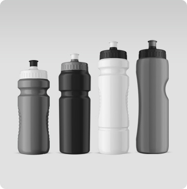
Highly ribbed surfaces, with embossments or numerous protruding elements, limit the branding area and complicate the application. On such a body, a 360° print is either not possible or comes out with deformations in places where the geometry changes.
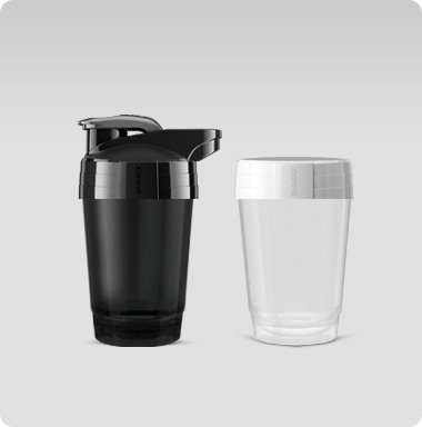
Our shakers contain a fluid capacity scale, the remaining part of the space is a smooth container without seams, which allows for applying graphics without gaps, from one edge of the scale to the other edge. (Ask about the print grid, and we will send you the full specification)
The contrast itself also counts. The body color should contrast with the logo colors: a light background for dark graphics and vice versa. On a transparent body, colors can be less saturated, and light elements may disappear without a primer — which is why brands with a multi-colored logo usually perform better on a white background.
See the effect before you order
Visualization for a 360° print is not optional. A flat PDF file does not show how the graphic wraps around the cylinder, where the seam falls, or how the logo behaves on the curvature. These things are only revealed on the finished product — when it is already too late.
Our visualization is free and ready within 24 hours of sending the file. You will see a shaker with your logo, in the chosen cap color, with the print layout on the full circumference — before any commitment.
When receiving the visualization, check especially: the proportions of the logo relative to the entire surface, the readability of the text at the actual scale, and the contrast relative to the body color.
Summary
A 360° print provides the largest brand communication surface that can be obtained on a shaker. The logo is visible regardless of how the product lies, how it is held, and how it sticks out of a bag.
With us, this surface does not cost extra — you pay for the number of colors, not for centimeters. This changes the design logic: instead of shrinking the graphic to fit the budget, you simplify the palette and use the entire shaker.
Send your logo and choose the capacity, you will see the visualization with the print tomorrow.